How Effective Is The Combination Of Your Main Product and Ancillary texts?
Part of my A2 Media Coursework was to make...


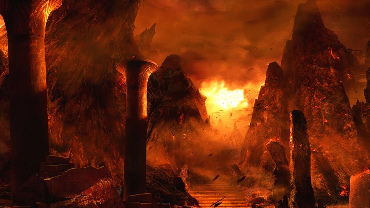 The main image was a photo of the stairs that i took when I was taking photos of the location and significant parts of the property. I decided to use this photo of the stairs, this was because, when I put filters on top of the photo, I liked that you couldn't see the bottom step of the stairs, it was as if there is darkness below. This was also connoting that evil lives below us. Below is where people who spirits are rejected and become a wandering soul. The souls of the dead must make their way to Jaaniw (the sacred dwelling place of the soul) - down in hell. I also layered the photo with a layer of 'fog' and 'ink' - this was to try to create a misty like effect as if it was hell at the bottom of the stairs.

Before designing my DPS, I decided to have a look at different layouts that were shown within magazines. I felt as if all the DPS's that I came across shown a very basic layout. When designing my own, I wanted to ensure that it abides by the conventions of a DPS magazine. To continue the continuity throughout my products, I had to stick with the same colour scheme which was grey scale - this was to then portray the horror genre throughout all of my products (Movie, Poster & DPS). I didn't want to make my article about the content of the film, this was because I didn't want to spoil what might happen within the film before they get to watch it. So, I decided to then make this DPS about a film review from 'The Horror Club' - this was so then I could identify certain aspects of my film which I personally thought worked well - this then can be portrayed to the audience reading the article.
 I took a lot of inspiration from the DPS that I analysed to my left of the 'Skyfall' James Bond film. On one side of the spread was a bold photo and then on the other side, a lot more detail which consisted of the Master-Head as well as the article about the film. I liked the way that the DPS didnt abide by the normal conventions of a basic layout with loads of writing. I tried to replicate this type of layout and add my own twist to it - this was because I thought that the James Bond DPS looked very professional and also not too busy for the audience.
I chose to also use photos that I had taken for my location. The door with the key hole I thought was very cool because it shown light through it. I used this photo because I wanted the audience to question what was behind the locked door and what they may come across if they watched the film. This advertisement can create an increase in the amount of viewings for the film.
- Short Horror Film
- Film Poster
- Double Page Spread
I chose my overall sub-genre of horror to be supernatural, this was because I enjoy watching the films like Insidious, The Conjuring & Annabelle. I like the supernatural feel of the scenes with the presence of a spirit or creature. I analysed these types of supernatural type of films so the I could interpret the codes and conventions into my own productions. All 3 products are all closely linked, this is to create continuity throughout. They all combine closely together to advertise and show off my film production.

Before designing my front cover and my Double Page Spread, I wanted to wait until my film was filmed & edited and ready for uploading. This was due to the fact that i didn't want to create my ancillary tasks and then they didn't fit with the film's brand and didn't link to my films genre.
By waiting, it meant that I was able to use a screenshot of the 'ghost' from the movie scene - this then shows the audience a little sneak peak of whats involved in my movie.
My Movie Poster

For my poster, I used the colour schemes of grey scale (Black, White & Grey) - this was down party because my film was very dark and I wanted to also show this within the advertisement like the film poster. Black and white is a combination of colours the really compliments each other really well. The colour black signifies death, evil, & mystery. Where as white signifies light, innocence & purity. As the colours contradict each other, its as if there is a balance.
When picking the master head (title), I wanted to ensure that it was bold, but wasn't a basic font. I decided on the font from the 'Grunge' section on Pixlr called 'Quick End Jerk'. I decided on this type of style of font partly because all the letters were in line. Some were up & some were down - this connoted the fact that throughout my film, there are ups and downs, but you don't know until the end who will be on top. I also increased the transparency of the words 'The Barn' - this was due to the fact that I didn't want the words to be very striking and in your face like most film posters. I felt as if the title gave the film a little bit of edge and mystery.
The main image was a photo of the stairs that i took when I was taking photos of the location and significant parts of the property. I decided to use this photo of the stairs, this was because, when I put filters on top of the photo, I liked that you couldn't see the bottom step of the stairs, it was as if there is darkness below. This was also connoting that evil lives below us. Below is where people who spirits are rejected and become a wandering soul. The souls of the dead must make their way to Jaaniw (the sacred dwelling place of the soul) - down in hell. I also layered the photo with a layer of 'fog' and 'ink' - this was to try to create a misty like effect as if it was hell at the bottom of the stairs.
At the bottom of the film poster, I added a billing block, this is not only used to make the poster look authentic, but also to let the audience know who's playing a role within the film as well as who produced it. I made sure that I abides by the conventions of normal film posters, this is mainly down to the fact that a lot of audiences watch films because of the actors that are acting in it.
My Double Page Spread (DPS)

Before designing my DPS, I decided to have a look at different layouts that were shown within magazines. I felt as if all the DPS's that I came across shown a very basic layout. When designing my own, I wanted to ensure that it abides by the conventions of a DPS magazine. To continue the continuity throughout my products, I had to stick with the same colour scheme which was grey scale - this was to then portray the horror genre throughout all of my products (Movie, Poster & DPS). I didn't want to make my article about the content of the film, this was because I didn't want to spoil what might happen within the film before they get to watch it. So, I decided to then make this DPS about a film review from 'The Horror Club' - this was so then I could identify certain aspects of my film which I personally thought worked well - this then can be portrayed to the audience reading the article.
 I took a lot of inspiration from the DPS that I analysed to my left of the 'Skyfall' James Bond film. On one side of the spread was a bold photo and then on the other side, a lot more detail which consisted of the Master-Head as well as the article about the film. I liked the way that the DPS didnt abide by the normal conventions of a basic layout with loads of writing. I tried to replicate this type of layout and add my own twist to it - this was because I thought that the James Bond DPS looked very professional and also not too busy for the audience.
I chose to also use photos that I had taken for my location. The door with the key hole I thought was very cool because it shown light through it. I used this photo because I wanted the audience to question what was behind the locked door and what they may come across if they watched the film. This advertisement can create an increase in the amount of viewings for the film.


Comments
Post a Comment